It gets to the end of the month and you know that it’s reporting time. You have a few days to analyse data and information regarding KPIs, when you have many other demands on your time.
Surely there’s a way to automate a dashboard or reports so that all your data is much easier to query and takes next to no time to do so? You’re right, there is.
Depending on what you are after could depend on what tools you utilise. Of course, you could use a mixture of any of the following that we’d recommend. However, at the end of the day, used properly they’re all going to save you plenty of time.
You want an interactive dashboard with filters you can query in seconds…
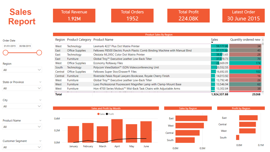
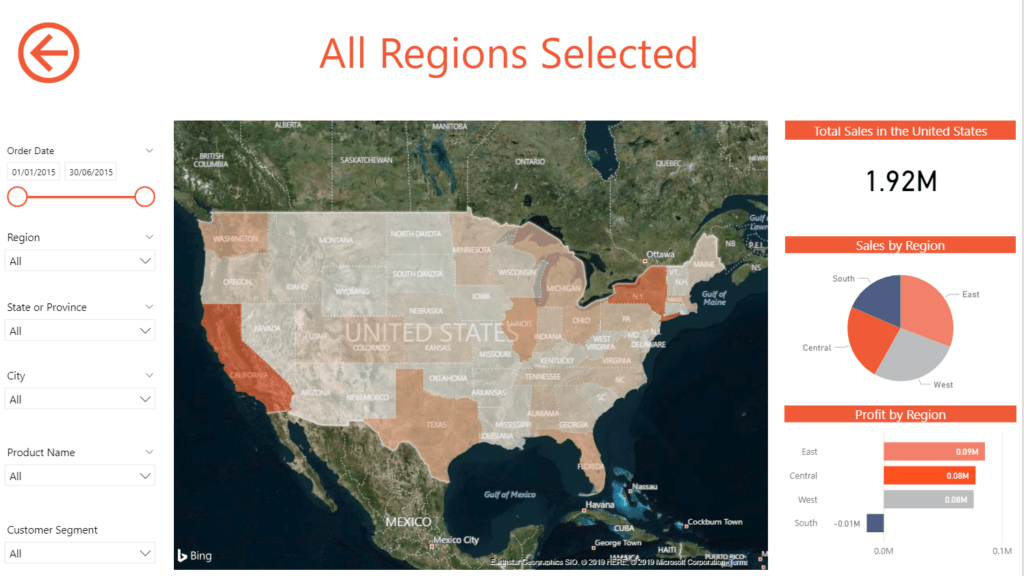
If this is the case, we’d recommend taking a look at Microsoft’s Power BI. This business intelligence service, which can connect with all your data sources, has the ability to provide interactive visualisations with self-service capabilities. Using a desktop or web interface, it can be accessed and utilised from anywhere with an internet connection. One of the main benefits is that Power BI is very user friendly, as data can be drag and dropped and very little technical knowledge is needed to function successfully.


With a huge selection of charts, graphs and visuals in which your data can be displayed, Power BI can provide you with a reporting solution for data driven decision-making. Being able to take and present Power BI dashboards in meetings, you’ll be able to answer the ‘what if’ and ‘how’ questions thrown at you by your management team by using filters and slicers to target only selected data.
You want a report you can query, with an understanding of your data…
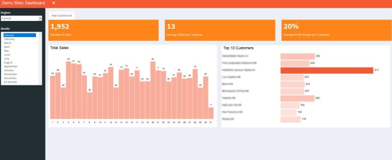
If you’re after a report that has basic tables and charts, can be queried instantaneously and shared amongst masses, then we’d recommend R Shiny reports. Whilst the dashboard produced by R Shiny is not as user friendly as it must be hard coded, there is a greater freedom for visualisations and graphics when compared with Power BI. As the dashboard is written in a statistical language (R), you can also complete more complex aggregations.

With R Shiny reports constantly pulling live data, reports can be setup so that recipients of the report will always have access to the latest and current data. This way all you need to do is send a URL or embed it into a webpage and you’ll have constant access to all your data. R Shiny reports can also be automatically sent via email.
You want a static report, which just needs to be viewed…
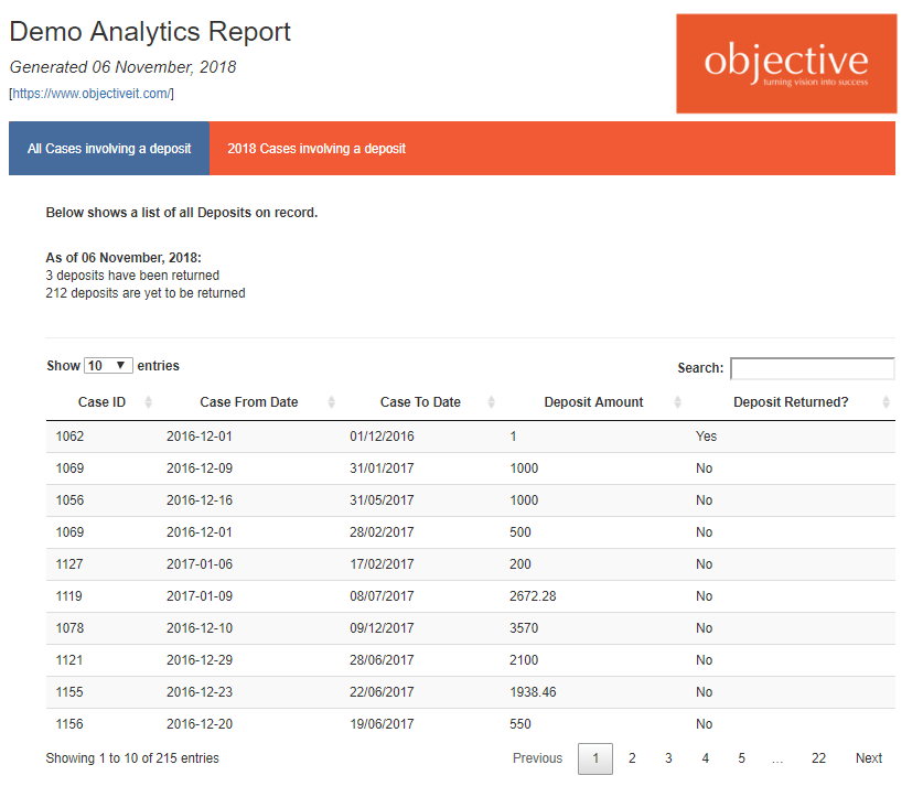
If you’re after a static report that can’t be drilled down in depth, then KnitR is more for you. It’s very similar to R Shiny in graphics it can provide, but it offers less interactivity due to the way that it functions. On the other hand, it’s very easy to embed it into a website or share it amongst a large amount of people.

Somewhat similar to R Shiny, KnitR reports will access the data and update however often you like, as it doesn’t pull the data live. This can be beneficial if you want everyone you send a report to to see the exact same data, as it won’t update to live data unless you request it to. These can also be automated via email.
Whatever kind of reporting functionality you are after, we can recommend the best solution for you and help you implement it if you need. We have data scientists who specialise in producing dashboards and reports that are user friendly, delivering according to your requirements.
When Business Intelligence is what you need, the team at Objective can provide a quality solution for you to surpass your current struggles.