Forget that new IPhone or 60 inch flatscreen TV…
Here’s a real christmas gift, the December Power BI Updates!!!
This Month sees a big push on visualisations! With loads of new custom visuals; would highly recommend checking out those by Zebra BI, as well as improvements to existing Microsoft visuals; such as the KPI and the Decomposition tree. Another long-awaited addition this month is the ability to change a Power BI theme without the need to learn Json.
Reporting Updates
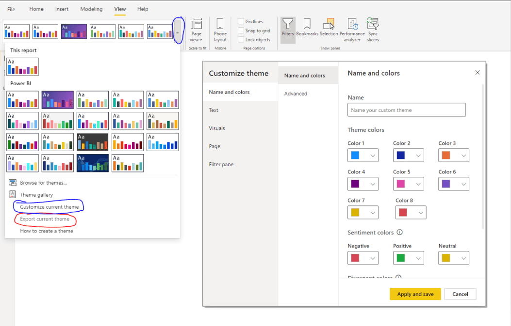
Two Big Updates To Customising Themes This Month!
- You can now easily modify your Power BI themes without the need to write a json custom theme file. By loading up Power BI desktop and going to the view tab in the report section you can now control features such as colours, font, font size and borders for power BI elements such as visuals, tooltips and the filter pain.
- You can also now export the current Power BI theme being used in your Power BI report (also shown in figure 1). This could be great for replicating themes across the business or to just get an idea of what a theme looks like in Json.
Adding A Custom URL To A Table Column To Matrix Value
Under the Conditional Formatting of a column, you can now add in a URL link. This will not change the value being reported in the table, however when you click on the value you will be taken to the URL attributed with your value.
KPI Visual Formatting Settings
There’s been some nice new updates to the KPI visual this month! You can now change the text size, colour, font and alignment of the main KPI and the KPI goal. You can also now change the transparency of the trend axis and you can add the date to the trend axis.
Decomposition Tree Formatting Settings
The Decomposition tree was a nice new addition last month. This month brings some extra formatting settings to the visual so that you can integrate it better into your own reports.
Hide The Filter Pane In Desktop View
It’s always nice to have a little extra space when designing a Power BI report. You could previously minimise the filter pane, but it would still take up a little room. You can now hit the filters button under the view tab to remove the filter pane completely. An important note is that this only hides the pane in desktop mode, this doesn’t delete the pane from the Power BI Service. To hide it in Power BI service you can click on the eye icon on the filter pane.
Extra Details Regarding The Automatic Page Refresh
When connecting to Power BI via Direct Query, you can set the refresh rate of your tiles. This will affect how often your tiles pull in fresh data. Power BI Desktop now gives you a few details on this refresh rate, such as how often you are allowed to refresh (as granted by your dataset admin), how often you are actually refreshing your data and the time of your last data refresh.
Analytics Updates
Analyse Insights Can Last Longer
Previously, analytics features such as the “Explain the increase” would occasionally time out if you have a large, complex dataset. You can now hit the play button in the analytics pop up to continue running the analysis.
New DAX: Quarter
This new DAX function returns the relevant Quarter of a given date.
Custom Visuals
- Visual Pane Personalisation Is Now Generally Available
- This Month Showcases Four New Visuals From Viz
- Hierarchy Tree: Reasonably similar to Microsoft’s very own decomposition tree, this chart lets you decompose hierarchical data in an easy to read tree format. This does provide a little extra functionality, with the ability to compare actual to budgeted figures, a search function to easily locate a node in a large tree and an easy to use arrangement tab to easily change how the tree is laid out.
- Bullet Chart: This chart is designed to show Actual figures to Previous or budgeted figures. There is a lot of customisability here as well as lot of fancy conditional formatting options.
- Parallel Coordinates: Not too dissimilar to a piece of artwork by Pollock, this visual really has a lot going on. It allows you to plot multivariate numerical data in the same plot, which may seem like a good idea, but in my opinion there is just too much going on to get any real understanding of the data.
- Gant Chart: This has all the functionality you would expect from a Gant chart with a lot of customisation. All in all, I would say this may well be the best Gant chat available at the moment.
Two New Visuals From Zebra BI
- You can easily change how your data is shown by clicking the left or right arrow on the chart, you can choose between 12 different types of chart.
- You can also enlarge the visual, and instead of the visual simply growing, the chart will split itself up into multiple charts. This makes the chart a little easier to understand if you have enough space to show it.
- Another cool feature is the grouping, if you add a category to the Group section this will produce a chart for each group, arranged differently depending on how you size the visual.
All these features are customisable, so if you don’t like an aspect of it you can remove it.
Zebra BI Table: referred to as a “Power BI matrix on steroids”, this is one of the nicest matrices I’ve seen inside of Power BI. This visual has everything you would expect from a matrix with a few little extras, such as the ability to hide columns only for a specific groups and the ability to choose which rows should have a subtotal.
ZoomCharts Drill Down Combo Bar Pro
Similar to last month’s waterfall chart from ZoomCharts, this chart is somewhat similar to what is already available inside Power BI. One nice feature of this visual compared to what’s available is the ability to combine bar, stacked and area charts all in one visual; however, personally I’m not a huge fan.
Queryon Annotated Bar
This visual allows you to create a bar chart but with customisable labels. One potential use being to show how close you are to a monthly or yearly target.
Tachometer 5 Range Chart
Standard Gauge with the ability to customise up to 5 ranges.
And here’s some animals in Christmas outfits, just because it’s Christmas!
Connectivity:
- Azure Data Lake storage Gen2
- Power Platform Dataflows connector
- The PostgreSQL connector is now includes the Npgsql provider
- AtScale connector is now generally avaliable
- Azure time series insights connector
- Data Virtuality connector
- Zucchetti HR infinity connector
Data Preparation:
AI Feature Updates and improvements (Premium Feature only!)
Last month, Microsoft introduced Azure ML inside of Power BI. If you had tried this and were experiencing a few issues, these should now be fixed. Microsoft have also added some new features such as drop downs, to improve the user experience.
Template Apps:
- Omnichannel Insights for Dynamics 365
- Customer service analytics for Dynamics 365
- Microsoft Forms Pro for customer service
If you do have data stored in the above I would highly recommend checking out the template apps to get a quick start in data visualisation.