Whilst we might be a little late this month, they’re here…
Power BI Updates for November 2019!
There are a lot of new visuals this month, with the Decomposition Tree leading the way for integrating Artificial Intelligence inside of Power BI. One other key change is the updates of the Power BI Desktop Ribbon, with the intention of making progressive changes over the next couple of months to align Microsoft’s Power BI more with Excel.
Reporting Updates
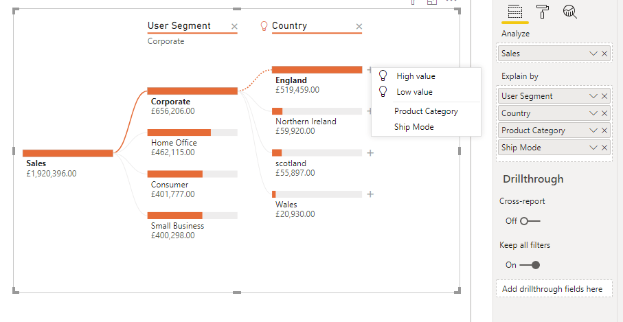
Decomposition Tree Visual
This new visual takes advantage of the growing AI capabilities inside of Power BI. This chart gives users flexibility when looking to drill down on a given variable. An exmaple in the image shown below (figure 1) shows a sales drilldown.
You can add multiple variables into the “Explain By” section of the chart, where the user can now choose what order they drill down on by using the “+” sign. There’s also the option to drill down on the “High Value” or “Low Value”, which will look through your data and give you the reasoning behind why your sales are at their lowest or highest. This filter is responsive to filters, so each time your filter changes it will recalculate which variables to show.
Analytics Updates
Conditional Formatting For Buttons
Microsoft are continuing down their path of adding conditional formatting to the entirety of Power BI. This month they’ve added this functionality to the buttons, allowing you to format colour, icon, outline and fill. You can now also add dynamic text to a button’s text or tooltip.
Custom Visuals
ProfitBase Financial Reporting Matrix
This is a very functional matrix if you’re planning to show financial reports inside of Power BI. This allows you to analyse your statements as a whole, with the option to drill down into key areas and compare the variance in your actual figures to your budgeted figures.
ArcGIS Map Updates
There are 3 key updates to ArcGIS this month:
- You can now connect to ArcGIS Enterprise servers
- You can have up to 3500 data points using a free account, or up to 10000 data points with an ArcGIS licence
- ArcGIS licence holders will now get free ESRI technical support for this visual
New Visuals From xViz
Advance Gauge: Reasonably similar to the other gauges already available. A slightly different feature is the ability to have both an inner and outer gauge. As always to note with xViz visuals, this does come with a huge amount of customisability
Hierarchical Filter: This is similar to a standard slicer, but just imagine it on a steroid cycle. This visual has everything you would expect from a hierarchical filter with the added extra that is an option to show a meaning for each measure for each level of the filter
ZoomCharts Drill-Down Waterfall Visual
This provides a nice user experience with a simple flow to the visual and has some good-looking default tooltips. However, it’s not wildly different to Waterfall charts currently available and to get the majority of the design customisabiliy you’ll need to purchase a licence.
Distribution
This is a new way to have a global slicer on a page. One benefit to using this is the customisability of the visual, with the ability to make the slice look like a chart legend, or to apply conditional formatting to each option.
Tree
A pretty standard tree visual but with some nice design customisablility. This visual does seem a little underwhelming when put in the same update as the new Decomposition Tree however.
Connectivity
Modern Ribbon
As mentioned, Microsoft are looking to align Power BI more so with Excel by implementing the ribbon. With the latest update some of the icons have been updated and conditional ribbon tabs have been added, depending on what you’re viewing. An example of this is the measure tab, which pops up when you click on a measure from inside the data view; this will then show you more detail about the given measure.
Future changes which we expect are the movement of visuals from the visual pane to the ribbon, as well as the addition of a dark theme!
Data Preparation
New AI Features Inside The Query Editor
This premium only feature has been added by Microsoft, bringing some of its more complex AI capabilities to Power BI desktop. You can now perform text analytics, detecting language, score sentiment or extract key phrases. The topic of an image can also be detected as well as apply your custom built azure models to data directly in Power BI.
Template Apps
LinkedIn Sales Navigator
To go alongside the new connectivity, Microsoft have added in a template app for LinkedIn Sales Navigator. This will allow anyone looking to make use of this connection to setup reports quickly and easy.